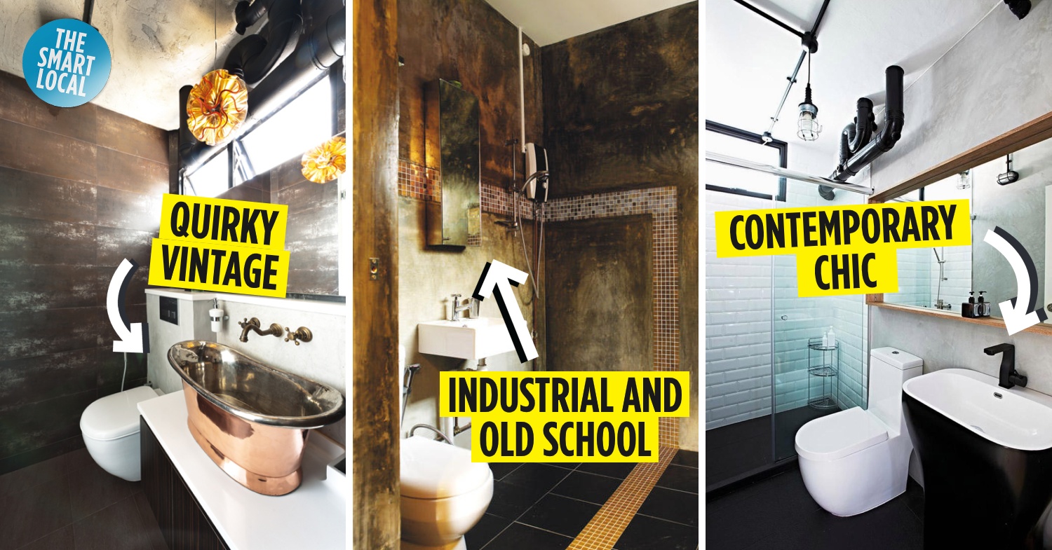
Beautiful HDB Toilets
An average person spends one and a half years of their life in the loo. If that’s not incentive enough to make it as comfortable and gorgeous as you can, I don’t know what is.
Most people believe that staying in HDB flats means you wouldn’t spend extra time in the toilet – it’s simply too cramped in there! And even if you start a remodelling project, a functional toilet takes priority over a pretty one. Toilets all look the same anyway, right? Wrong.
Here are 16 HDB toilets with beautiful thrones you wouldn’t mind occupying for as long as you can.
Check out other interior design inspirations:
1. Bright and breezy
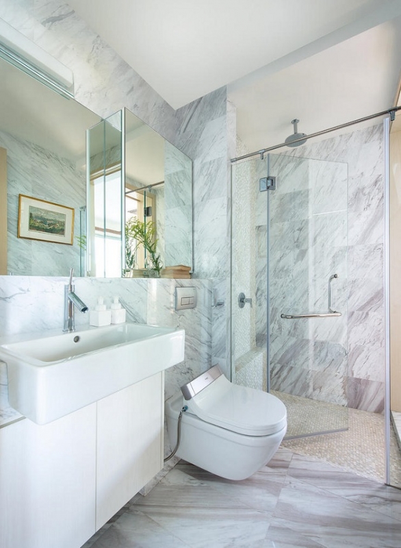
Image credit: Collective Designs
Interior Designer: Collective Designs
Keeping to a neutral palette of white, grey and beige, this marbled loo looks like it belongs in a beach resort. The colours used make the washroom look sparkling clean and breezy with lots of air circulation.
2. Industralised
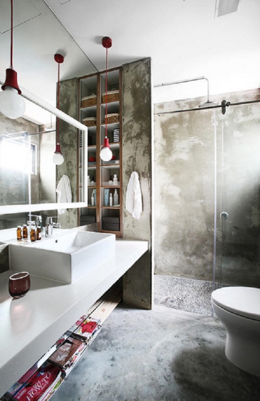
Image credit: 19sixtyseven
Interior Designer: 19sixtyseven
The raw concrete walls and floor, coupled with the hanging lights give the toilet an industrial, unfinished look. The in-wall compartments and shelving under the sink also means less clutter on the counter.
3. Polka-dotted Minimalist
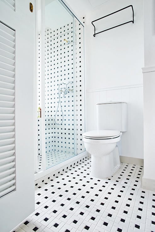
Image credit: The Association
Interior Designer: The Association
The black squares on white tiles look like polka dots and remind me of dalmatians! It is a simple change but adds a fun vibe, and is one of the more unique designs that I’ve come across.
4. Cozy Grey
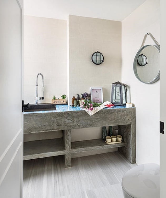
Image credit: three-d-conceptwerke
Interior Designer: three-d-conceptwerke
This lavatory has a cosy, open feel – perhaps because of its uniform colour scheme. The blue tiles on the sink counter give it a pop of colour. The lights also play a part in giving it a cottage vibe.
5. Extreme Old School
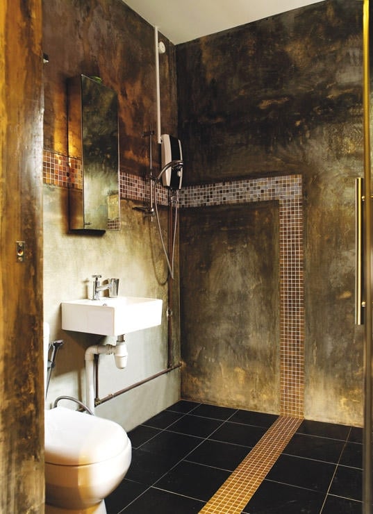
Image credit: Vegas Interior Design
Interior Designer: Vegas Interior Design
This designer took industrialized and old-school to the extreme, giving the concrete walls a scorched look. Certainly not for most homeowners, but a design like this would be a definite talking point when guests come over!
6. Otherworldy Shower
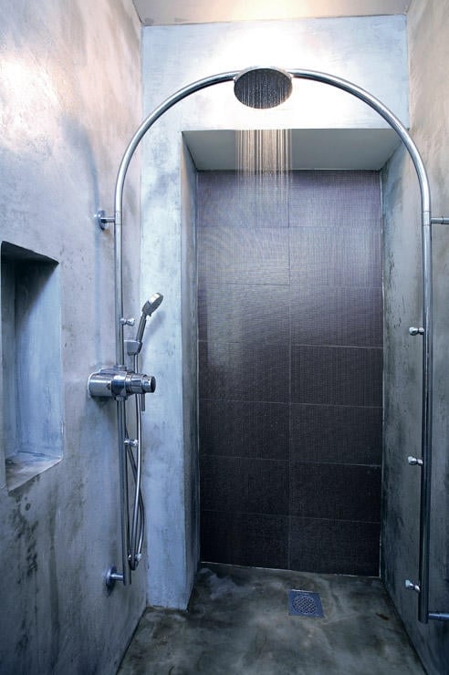
Image credit: Metaphor Studio
Interior Designer: Metaphor Studio
This is my favourite of the lot. The overarching shower reminds me of futuristic space movies. The recess in the wall and the all-concrete surroundings add to this effect, proving that the use of concrete shouldn’t be restricted to industrial themes.
7. Resort Style
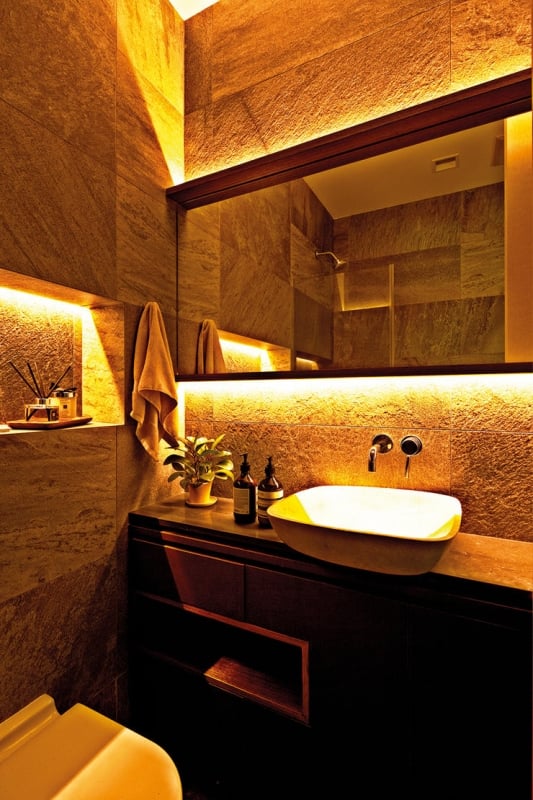
Image credit: Project File
Interior Designer: Project File
With textured tiles and warm lighting, you can create a resort-style washroom like this too. The lights illuminate the mirror and cast a glow on the rest of the toilet. All you need to complete the experience are some scented candles.
8. Contemporary Chic
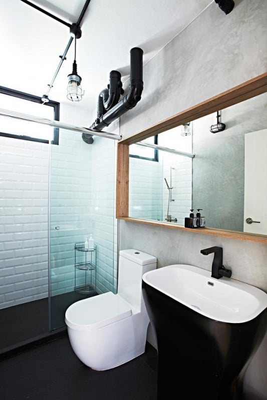
Image credit: Space Sense Studio
Interior Designer: Space Sense Studio
The tinted glass, coupled with the monochromatic furnishings and pipes, make this powder room sleek and chic. There is a lot attention to the details here too – check out the unique tap!
9. Emerald Throne
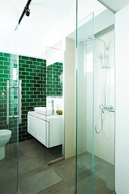
Image credit: box.id studio
Interior Design: box.id studio
The shimmery dark green tiled walls remind me of the Emerald City in the Wizard of Oz, and is a nice focal point for the otherwise white bathroom. Sometimes a unique dominant colour is what you need to stand out from the rest.
10. Hotel-esque
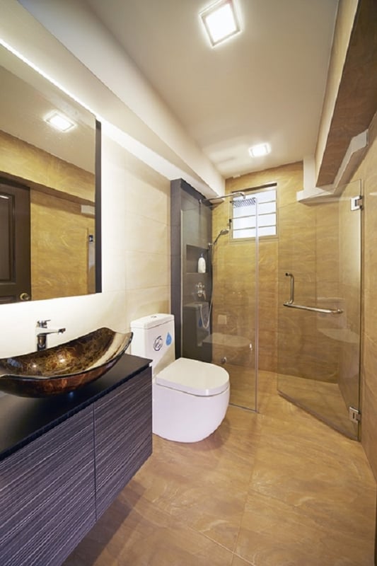
Image credit: Carpenters
Interior Designer: Carpenters
This washroom has a polished hotel vibe, with a marbled floor and gold-veined basin. The mounted furnishings and glass door make it appear more spacious.
11. Wooden Luxury
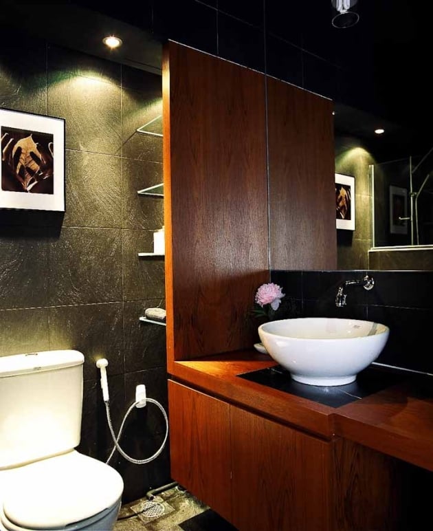
Image credit: Rezt n Relax
Interior Designer: Rezt n Relax
The wooden panelling and dark colours, along with bright lights, make for a cosy and sophisticated look. For those who prefer a modern feel, this toilet will appeal to you.
12. Modern Black
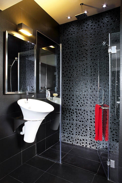
Image credit: Space Sense
Interior Design: Space Sense
An all-black theme for this modern contemporary shower room is spiced up with a pebble-washed wall. Offset the black colours used with colourful toiletries – like a red towel. To make sure the toilet doesn’t look dim, more lights should be added in.
13. Angular
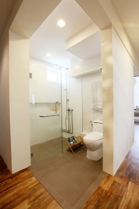
Image credit: Free Space Intent
Interior Designer: Free Space Intent
The designer chose to go with an open concept for this toilet, with angled walls to ensure some privacy. While simplistic and not the prettiest, this restroom is certainly unique. I definitely wouldn’t dare to have this though, it’s too public for my comfort.
14. Raw and Basic
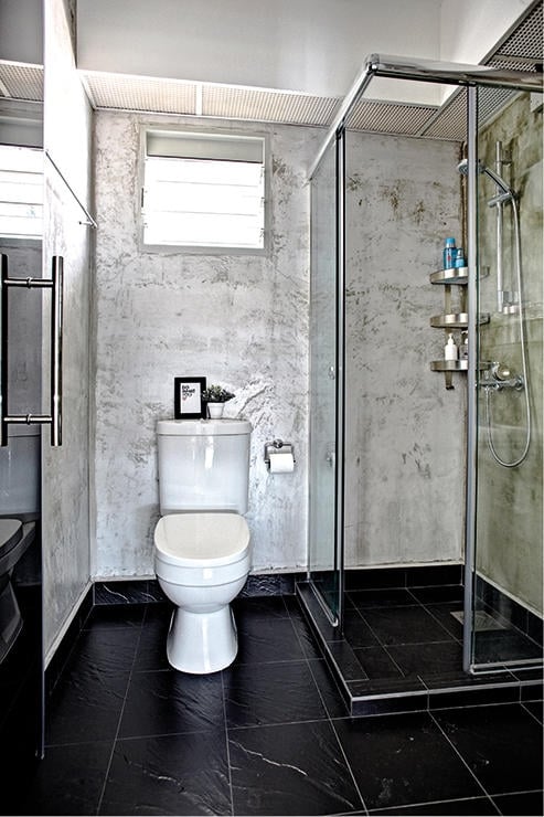
Image credit: Spacious Planners
Interior Designer: Spacious Planners
This lavatory has a raw, simple look – basic and no-nonsense. The industrial look of the concrete walls is offset by the black tiled floor, which lends a modern touch to the room.
15. Glassy Blue
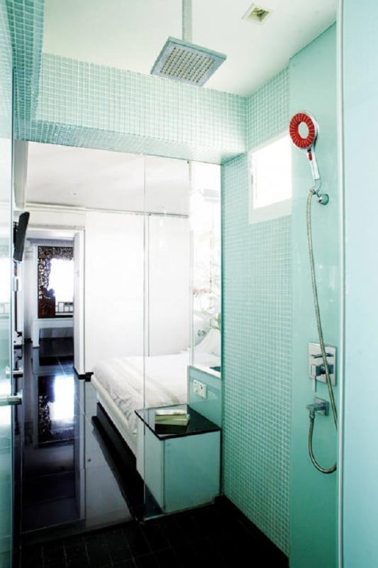
Image credit: Decomax
Interior Designer: Decomax
The tinted glass walls and aquamarine tiles make this shower room look like a fish tank. The colours chosen have a refreshing effect and you can totally imagine being underwater here. I can’t explain why, but the red shower head adds to the submarine feel!
16. Quirky Vintage
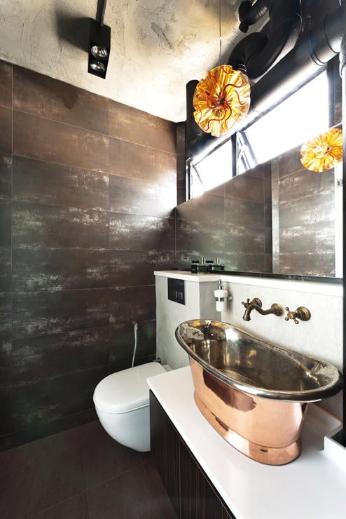
Image credit: Prozfile
Interior Designer: Prozfile
The highlight of this bathroom is the specially-sourced copper sink, which fits in well with the vintage theme. It complements the old-school tap and faded walls.
The best-looking HDB toilets in Singapore
Due to the purpose of the toilet, people may overlook it while remodelling the rest of their houses. But considering how much time we spend time inside, we shouldn’t deny ourselves the luxury of comfort and beauty while going about our business. Hopefully, this list will give you some ideas about how you can redesign your toilets.
Check out more guides to HDB renovations:
- Home renovation tips to save money
- Stunning HDB renovations under a $30,000 budget
- Renovation tips to make your HDB look bigger
- How to decorate your HDB for a high-SES look
Original article published on 18 November 2014. Last updated by Josiah Neo on 13 November 2020.
