Logos with hidden meanings in Singapore
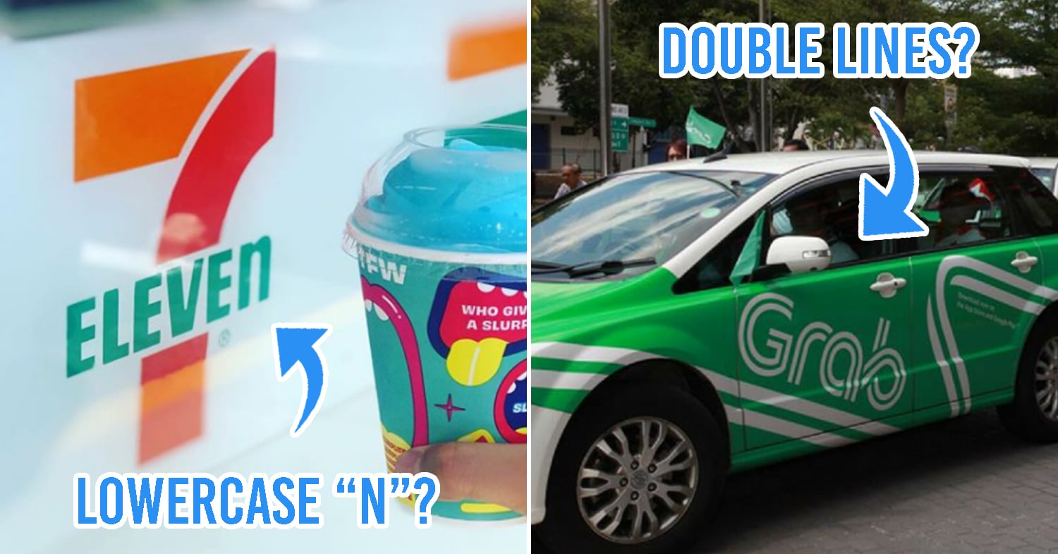
Image adapted from: @hello_arizona and Grab Singapore
As Singaporeans, we’re always on the go and in a rush to head off to somewhere. So even though we see plenty of logos printed on advertisements, product packaging, and even office buildings on a daily basis, we pay little attention to them.
While logos are so saturated to the point where we’ve grown to ignore them, there are many minute details that most people don’t notice. From popular food spots like Genki Sushi to tech products like Apple, here’s the 411 on 10 everyday logos you’ll find in Singapore:
1. Carousell

The logo has 5 “fins” to represent Carousell’s code of ethics – things like “mission first” and “care deeply”.
Image adapted from: @xyz_lab
Carousell is one of those online platforms that everyone’s used at least once – whether it’s for scoring limited edition sneakers or selling off your old clothes.
There’s an interesting backstory to the brand: after watching an episode of Mad Men, the founders went with the name “carousell” based on the once novel invention of the Kodak Carousel.
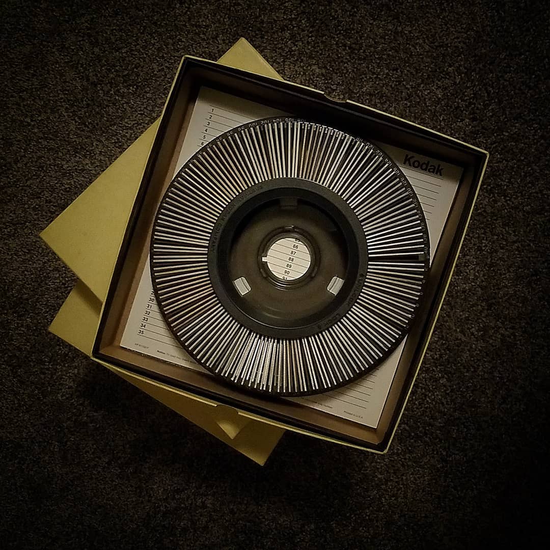
You can see the influence of Kodak Carousel in the Carousell logo
Image credit: @julie_abnet
As an old-school slide projector used to view photographs, this carousel was lauded as similar to the iPhone of the century – it was equally trendy and cutting edge back then.
As mentioned by the founders, “the Kodak Carousel goes backwards, forwards, and uses images to tell a story”. In sharing new and old things, along with the stories behind them, it’s similar to the Carousell of today.
2. Grab
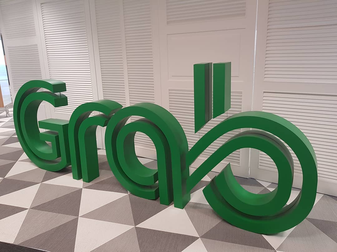
Image credit: @shauntmw
You won’t think twice about it, but Grab’s logo is intricately designed to mimic roadways and transport paths. They’ve said so themselves, suggesting that their flowy lines and curved shapes represent “the endless road of possibilities”.
If you squint, the logo does indeed look like a transport network – with winding roads and twisty u-turns.
3. Singapore Airlines
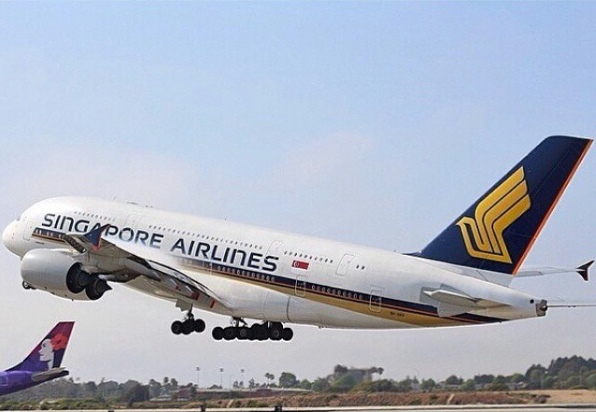
The Singapore Airlines logo was originally designed by a US-based company and famed French designer Pierre Balmain – who’s also behind the SIA kebaya uniform!
Image adapted from: @dio737
As our national flight carrier, Singapore Airlines always holds a special place in our hearts. With its bird insignia in navy blue and yellow colours, it’s a sight we associate with holidays. But several questions arise when we take a closer look at this familiar logo.
For one, why does the word “airlines” come with a lowercase “n”? And why the stylised bird? The former remains a mystery, perhaps solely developed for aesthetic reasons, but we can answer the latter: the bird is inspired by a silver kris – in Malay, known as “keris”, a Southeast Asian dagger that comes up frequently in mythology and local folklore.
4. 7-Eleven
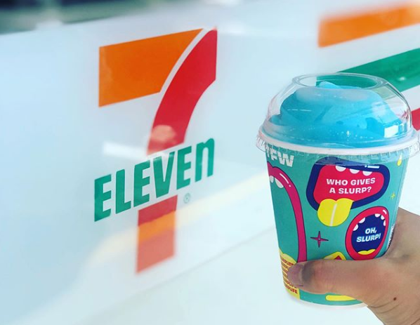
Image credit: @hello_arizona
Whenever we see a 7-Eleven logo on the street, we’ll rush in instantly on sweltering days for a brain freeze-worthy Slurpee. But upon a second look, you’ll realise that all the letters in the logo are in uppercase, except the lowercase “n”.
The supposed reason behind this is that the wife of the company’s president felt that an uppercase “N” was too harsh. However, some people believe that this was done for feng shui reasons, as a lowercase “n” would attract more business.
Fun fact: 7-Eleven stores used to be open only from 7AM-11PM instead of the 24/7 operating hours it has today, which is how its name came about.
5. Genki Sushi

Image credit: Genki Sushi Singapore
While most people are curious about how Genki Sushi’s super-speed conveyor belts work, another question that surrounds the brand is their logo – which looks like an angry fishball of sorts.
There are a few explanations that decode this mystery, but the one that’s most fitting is that the logo is meant to portray a sushi chef in action. The angry arched brows and frown is to symbolise the chef’s game face, when he’s in the “zone”.
Also, the 2 red dots on the cheeks mean “genki”, which translates to being energetic and positive.
6. KOI Thé
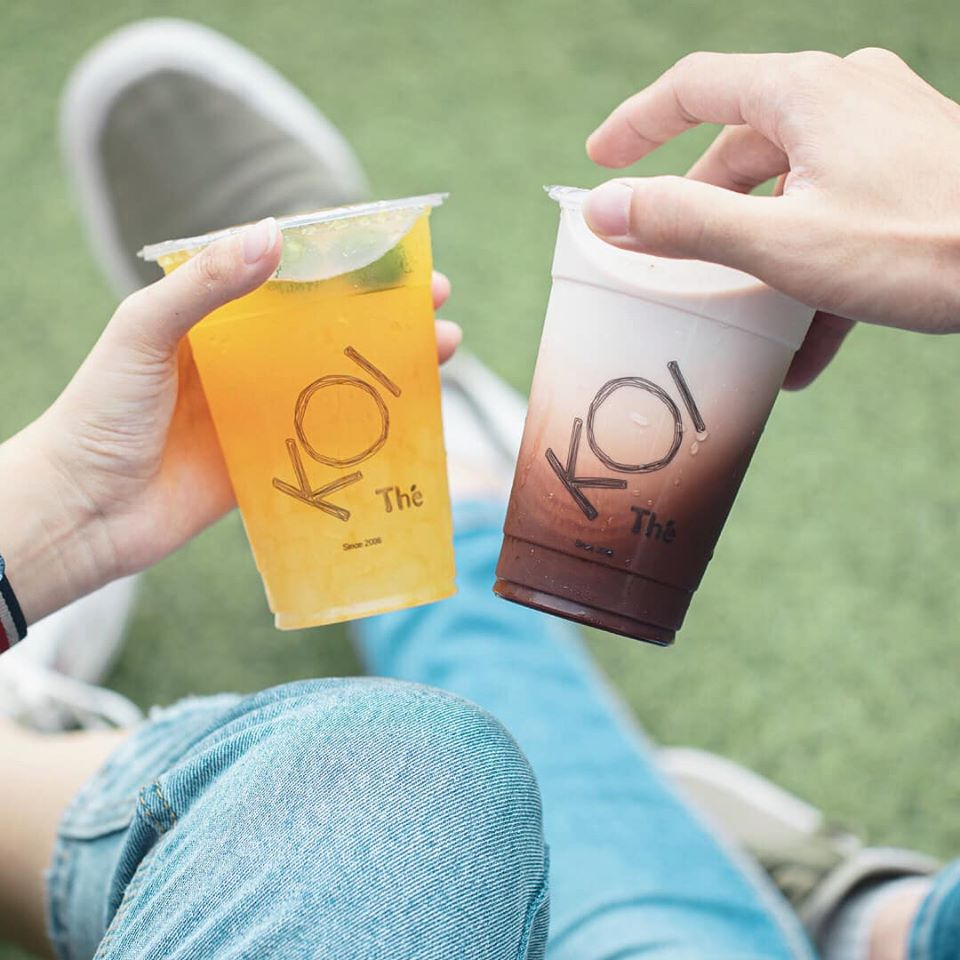
Image credit: Koi Thé Singapore
No matter which BBT brand you spend most of your moolah on, KOI Thé is definitely one that you’ve heard of. Interestingly, tilting the cup slightly reveals a deeper meaning to the brand’s name, as it forms the word dou (豆), which means “bean” in Chinese.
This is because some teas and coffees are made from, well, beans.
7. Starbucks
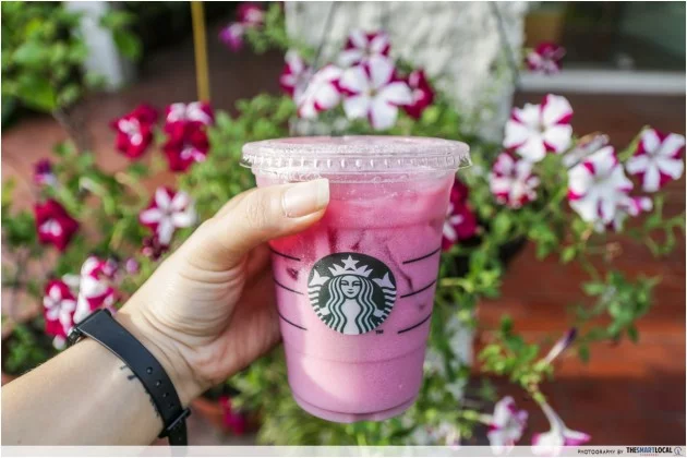
We all have that 1 friend who seems to be hooked on Starbucks without any plausible explanation. But other than the frequently updated concoctions by Starbucks, there’s much to uncover about their iconic green and white logo.
Riding on the term “perfect imperfections”, the lady seen on the logo is specially made to be slightly asymmetrical. From rounded edges to the subtle shadow on the right side of her face, the Starbucks mascot takes on a more personable and natural aura.
She’s also a Siren, which is a Greek mythical creature that’s known for luring and tempting sailors out at sea. Similarly, Starbucks hopes to continue drawing in customers to buy their coffee through their logo. From the looks of it, it’s working.
8. Apple
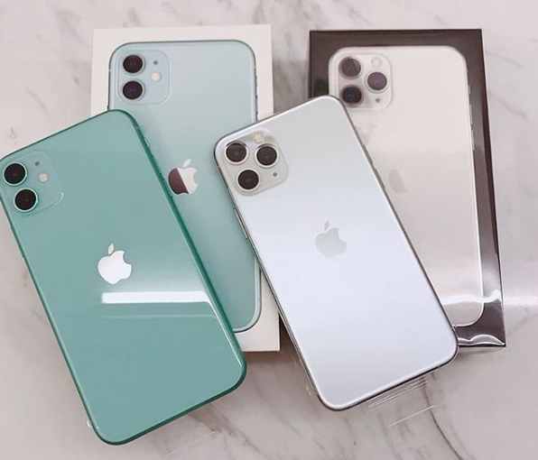
Image credit: @asia_ponsel_shop
Apple is the pinnacle of genius marketing and branding. So much so that when we think of the word “apple”, our minds draw automatic links to iPhones. The logo is based on a simple apple shape that comes with a bite, and has a few myths surrounding the story of it.
The most common take? That the logo is inspired by the biblical tale of Adam and Eve – it represents an apple from the Tree of Knowledge. With that being said, the designer himself revealed that he came up with the idea after taking a bite of an apple and realising that “bite” sounded like “byte”.
9. Adidas
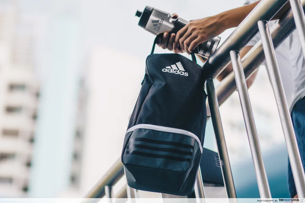
With over 20 retail stores islandwide, international sportswear brand Adidas is certainly no stranger to us. Whether it’s their athleisure gear or sports accessories, everything is branded with their iconic 3-stripes logo.
This logo is designed to look like a mountain, with each stripe longer than the previous one. Behind this, is an underlying message to inspire people to overcome whatever uphill battles and challenges that come their way – with Adidas merch, of course.
10. Total Defence
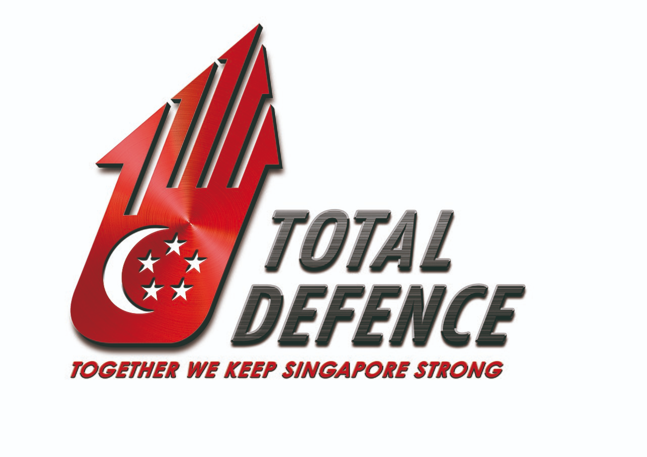
Image credit: MINDEF Singapore
Total Defence Day is something that we’ve all experienced in school, be it by having emergency drills or eating sweet potatoes and plain biscuits to experience the hardship that the older generation endured. But beyond going through the motions and occasionally seeing the logo around, most people don’t think twice about the meaning behind it.
The logo is smartly designed with an outline of a hand – to represent unity when we all stand together. It’s also woven in the shape of a house to symbolise Singapore as our homeland. To safeguard the security of our home, everyone needs to play a role in Total Defence.
Pick the new total Defence Logo for Singapore
Whether it’s cleverly incorporating a hidden word like KOI Thé, or having a known temptress as a mascot like Starbucks, logos play a huge role in shaping how we look at brands – after we unveil the hidden easter eggs in them.
Besides searching for hidden easter eggs in Singapore’s existing logos, you can also be part of the logo creation process with the Total Defence Logo Competition.
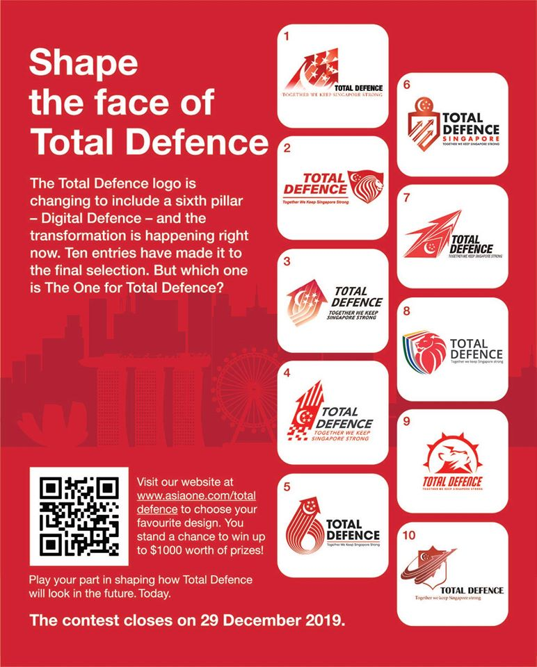
Image credit: We Are Total Defence
Organised by Nexus, the Total Defence Logo Design Competition has 10 shortlisted logo entries that are open for public selection. From now to 29th December 2019, stand a chance to win attractive prizes up to $1,000 simply by picking the logo that best represents Singapore’s 6 pillars of Total Defence.
In the era of digitalisation, Singapore has added a 6th pillar to the existing 5 pillars of Total Defence: Military, Civil, Economic, Social, and Psychological Defence. This new pillar is known as Digital Defence to counter threats from the digital domain, such as cyberattacks and fake news.
Just like how the current 5 arrows merge into an upward arrow in the logo to symbolise Singapore’s progress towards a bright future, the new logo should aptly emphasise on the importance of total defence for our Little Red Dot.
The top prize is a cash voucher worth $1,000, while runner-up prizes include 20 cash vouchers worth $100 each. There’ll also be 5 pairs of Cathay Cineplexes Everyday movie vouchers given out each week.
So, head over to the website here ASAP before the contest ends!
Find out more about the Total Defence Logo Design Competition here
This post was brought to you by We Are Total Defence.