BTO room design tips
Decorating your home can be a fun but daunting process. Between painting the walls and furnishing the rooms, there are tons of decisions to make that can be overwhelming – especially if you don’t know where to start.
Sure, you can hit an interior designer up for advice that usually comes with a larger price tag. But if you prefer to D.I.Y. things, here are four easy tips to make your BTO look like a million bucks.
1. Liven up the space with textured patterns
To jazz up a neutral space that’s anchored by statement furniture like a black sofa and a walnut sideboard, think about adding some textures and patterns.
For an option that won’t break the bank, opt for a laminate – you can put these on any wall, cabinet, and counter space you like. Go for a textured wood laminate for a rustic-chic vibe, or smooth wood for a sleek modern interior. Not only are these textures timeless, but they’ll also give your room a major pop.
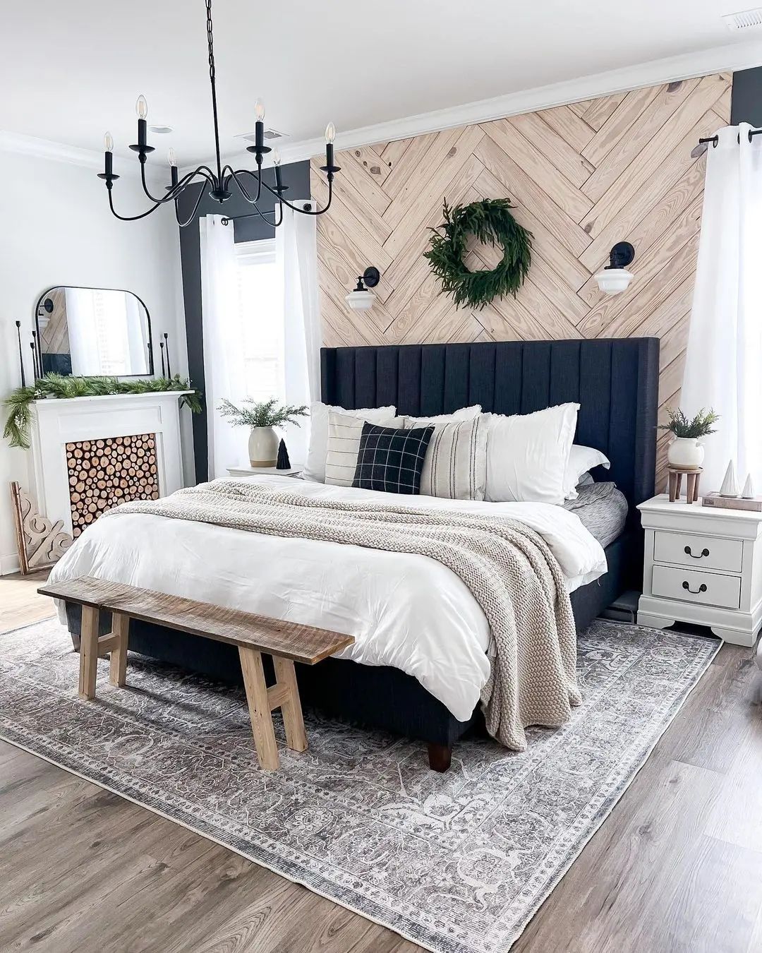 Image credit: @lxhomedecor
Pro tip: To avoid crowding the space with too many details, opt for simple cabinets and countertops using neutral coloured laminates. These surfaces are prone to wear and tear, so it helps to use anti-finger prints and scratch resistant laminates – like the Supreme Lite series at Arova.
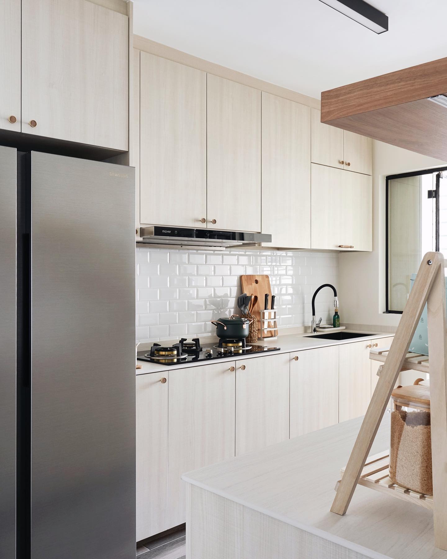 Image credit: @_choonsze
For example, white and light woodgrain laminates will give your room that Scandinavian feeling without clashing with the accent wall or the bookcase. On the other hand, concrete and slate laminates are perfect if you’re after an industrial-looking style.
2. Use lighter hues to make your room look bigger
If the idea of committing to bold colours intimidates you, play it safe by sticking to white. A white room doesn’t necessarily mean it’s boring looking. Do it right and your white walls can make your space look bigger and be the perfect backdrop for your furniture.
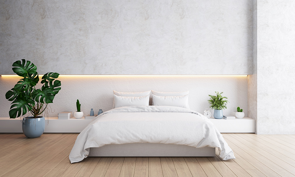 Image credit: Design Cafe
Play around with variations of white, such as creamy white lacquer, rustic white wood and white marble on your walls, doors and kitchen cabinets. You can also try the latest trend by pairing your white goods with stainless steel and gold fixtures to create a warmer, luxe look throughout the home.
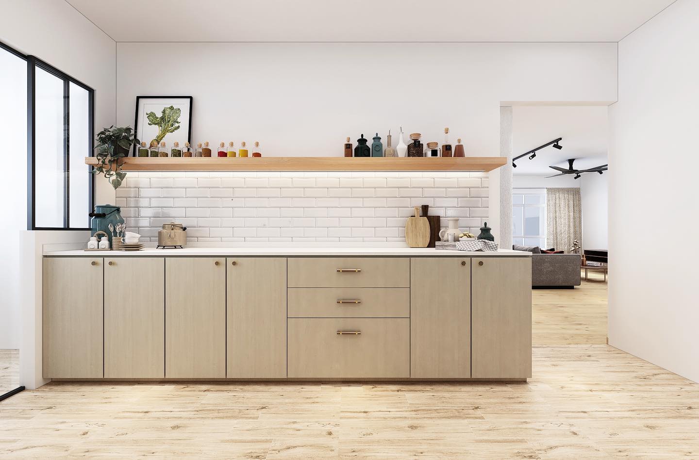 Image credit: @_choonsze
Pro tip: White is a powerful and versatile colour choice for interior designing, and a variety of white hues will make your home feel bigger and more chic. If you’re looking to dress your kitchen in white or a light hue, check out a wide range of Arova’s high wear-resistant laminates that come in woodgrain.
As for the kitchen wall, Arova’s magnetic laminates can double up as a decorative wall, as well as a space to leave notes and grocery lists.
3. Choose colours that are complementary
Decorating your home using neutral colours has always been a safe choice. However, once in a while, it’s refreshing to follow the trends and use bold contrasting colours.
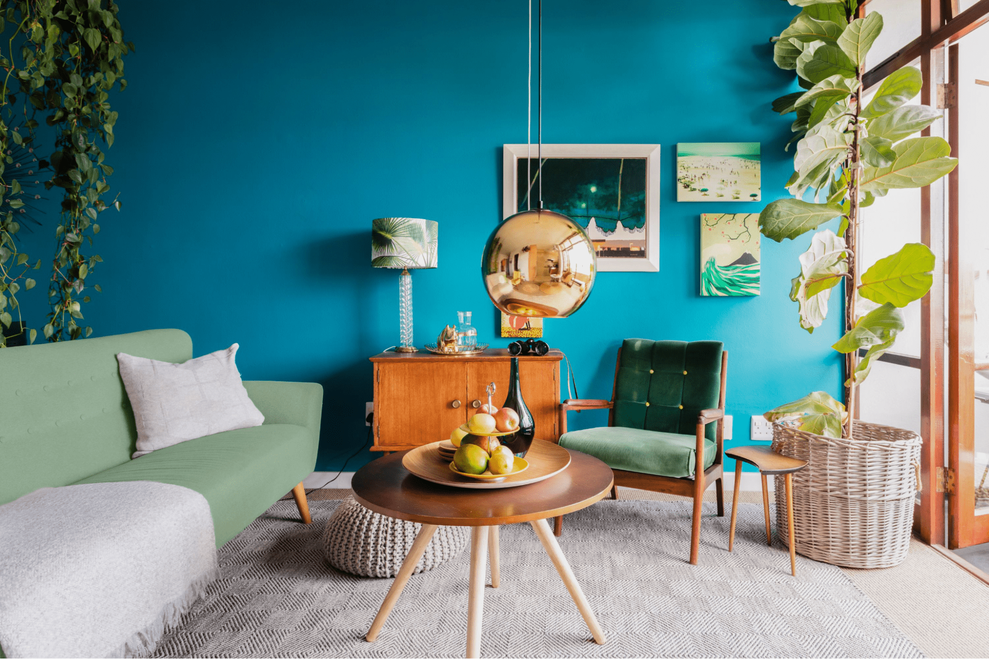 Image credit: The Spruce
Of course, we’re not saying you should go and paint one wall red and the other green. But it’s a good idea to use accent throws, pillows and other decorative elements to accentuate the space. If you’re after a minimalist home with just a slight splash of colours, try using a neutral-coloured accent wall. This will add just a dash of colour to your space without making it look jarring.
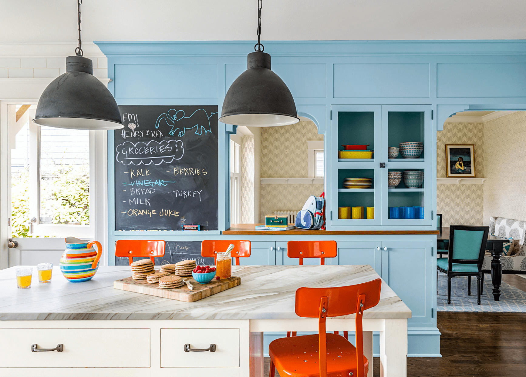 Image credit: Better Homes and Garden
The key to nailing your complementary colour scheme is to use them in the right proportions. But remember, less is more.
Pro tip: use a simple colour wheel to identify hundreds of colour combinations, such as blue and orange, and build your colour scheme from there. For even better visualisation, have a look on sites like Pinterest and see all the splendid colour combinations the design pros have put together.
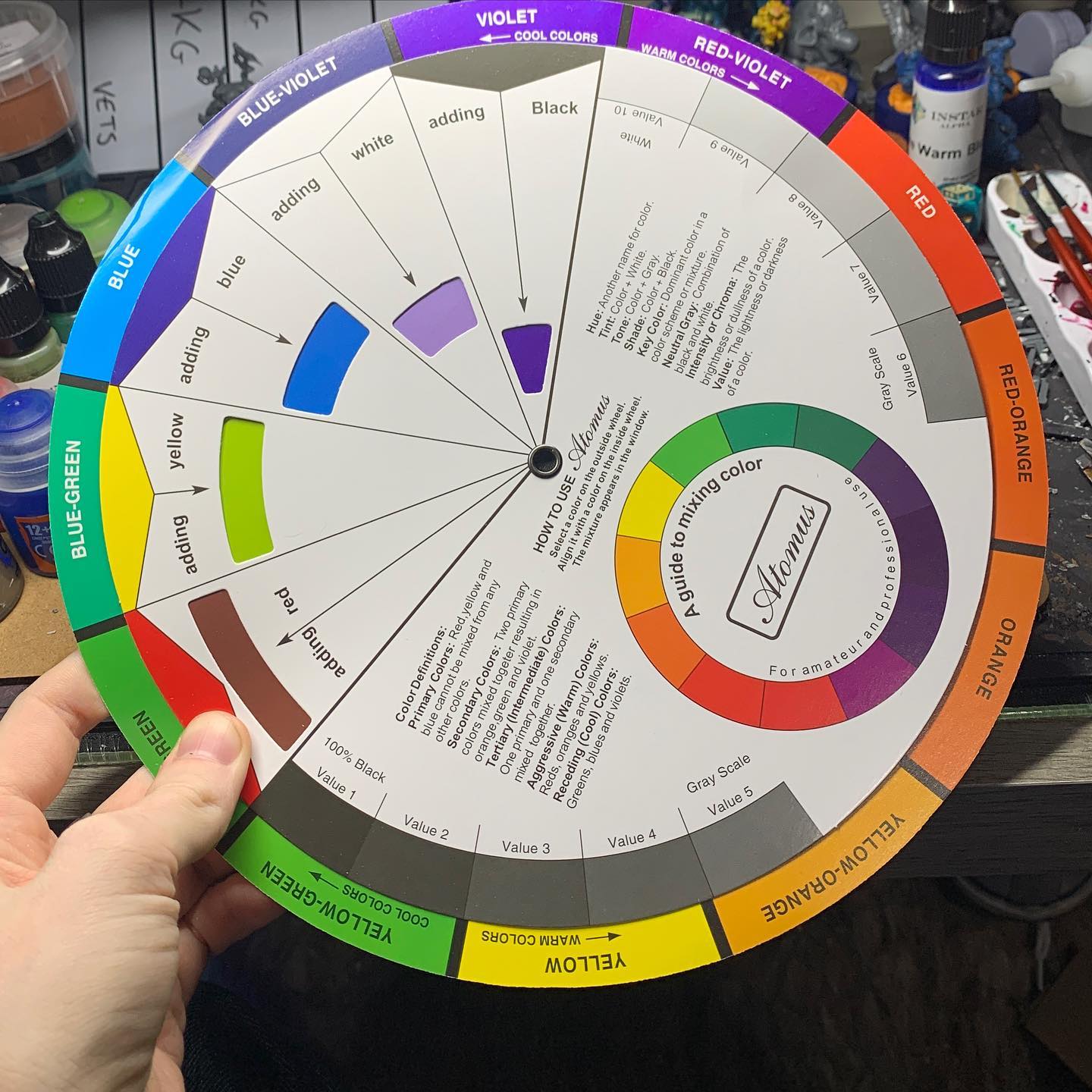 Image credit: @purplemonkey790
The theory of opposites attract might only work five times out of ten in a relationship setting. However, apply it to your home and you’ll be pleasantly surprised by how chic your place will look.
4. Follow the 60-30-10 proportion rule
If you’re not an interior design pro, a rule of thumb is to follow the 60-30-10 colour proportion rule to the T. In a nutshell, it teaches you how to divide colours into three categories to create a balanced home: 60% main colour, 30% secondary colour and 10% accent tone.
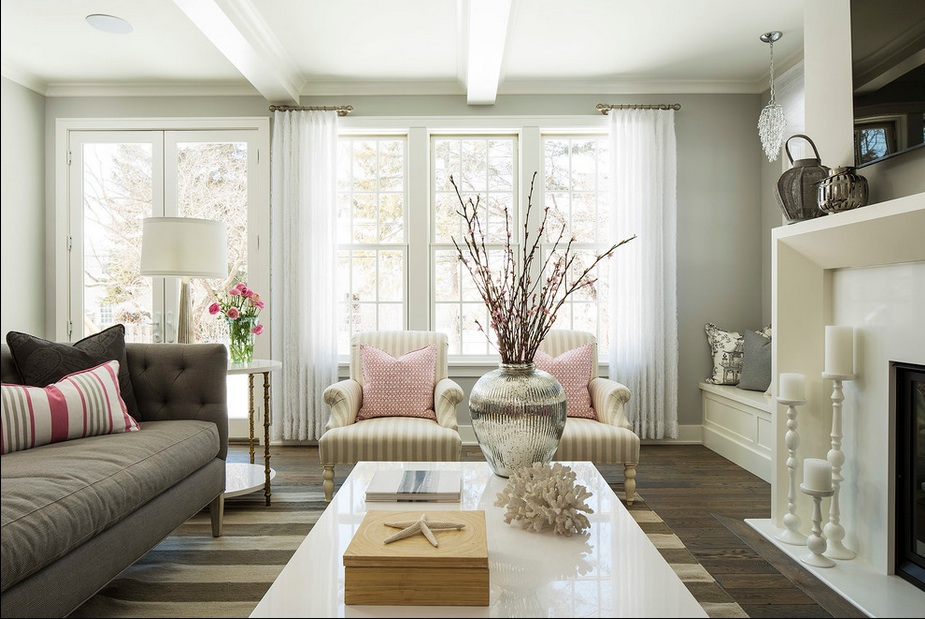 Image credit: Apartment Therapy
Things that take up a large space, such as walls, couch and bed should take the main colour and occupy 60% of your colour scheme. To play it safe, use a neutral tone like white or beige. However, if your soul seeks a bright colour, use it with 30% of a muted supporting colour.
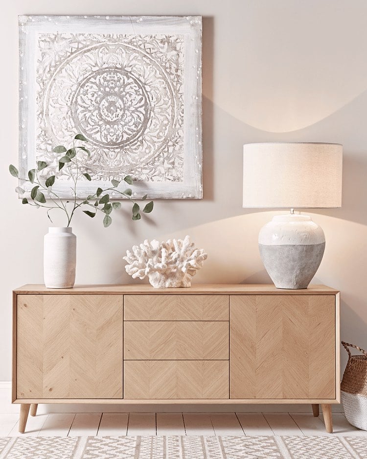 Image credit: @our_scandi_house
The 30% complementary colour is meant to add a personality to the space. So feel free to use your fave colour on curtains, carpets and smaller furniture. Just make sure it complements your main colour.
Finally, the 10% accent colour – the cherry on top – should be used on throws, pillows and even decorative flowers. Keep in mind that you can rotate this colour based on your mood or a festive time of the year, like Christmas.
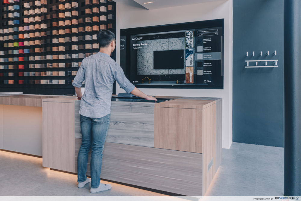
Pro tip: To visualise how your colour scheme will look IRL, use a simulator to create your home. At Arova’s showroom, you can see what your BTO flat would look like on a laminate simulator and apply whichever design you have in mind. That way, you’ll know for sure what your place will look like prior to committing to certain colours.
Spruce up your BTO with over 500 laminates at Arova
Whether you’re a new homeowner looking to DIY your flat’s interior, or you just want to redecorate, bookmark these design tips and also have a look on Arova’s website.
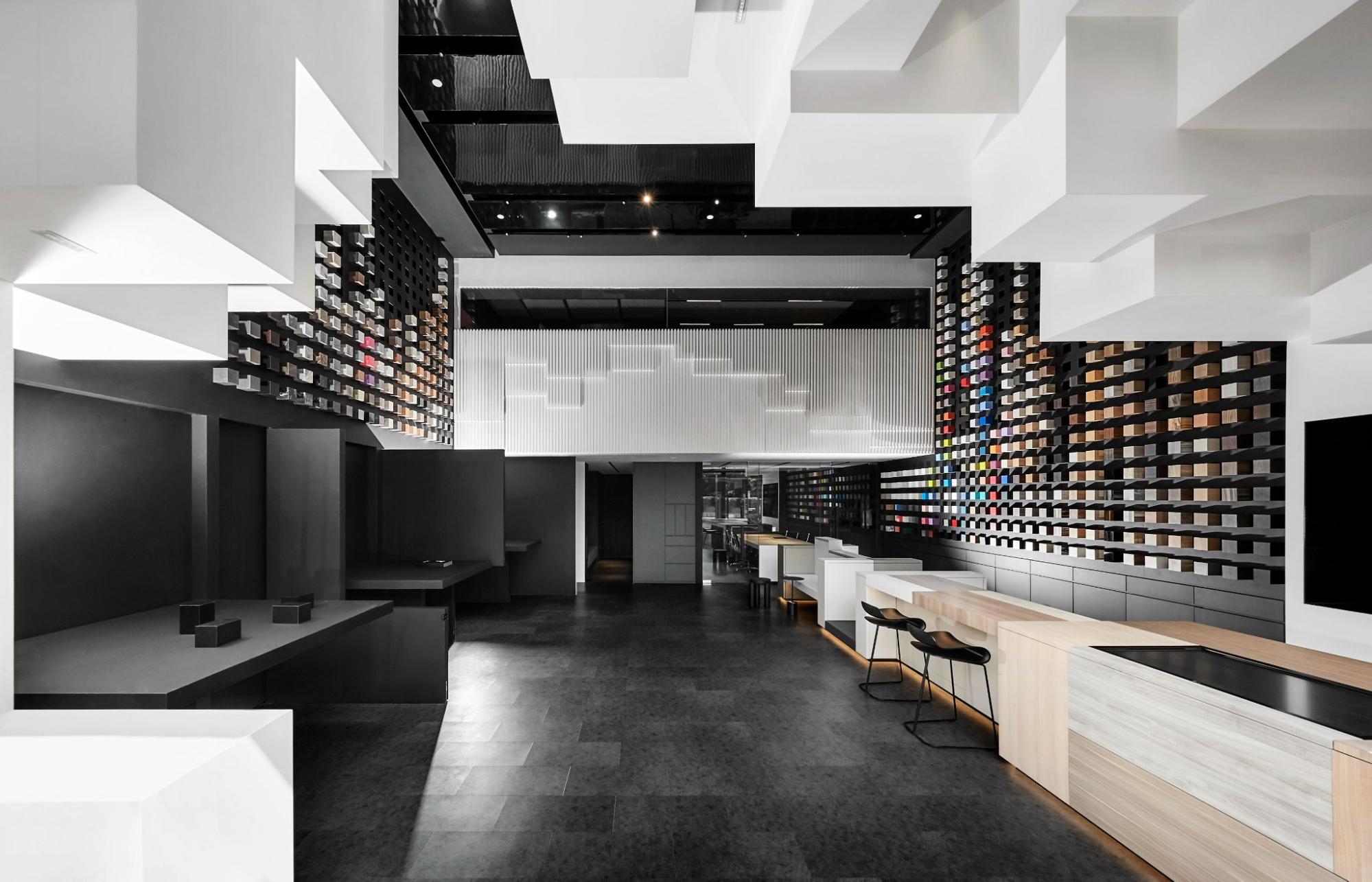 Image credit: Arova
Expect to find a slew of online services to help ease you into renovating your home. You can explore the “find what you like” function to get design inspos and laminate suggestions for any room you’d like. Plus, if you’re one who spills often, hit the “oh no spills” button and you’ll receive effective cleaning tips for each surface.
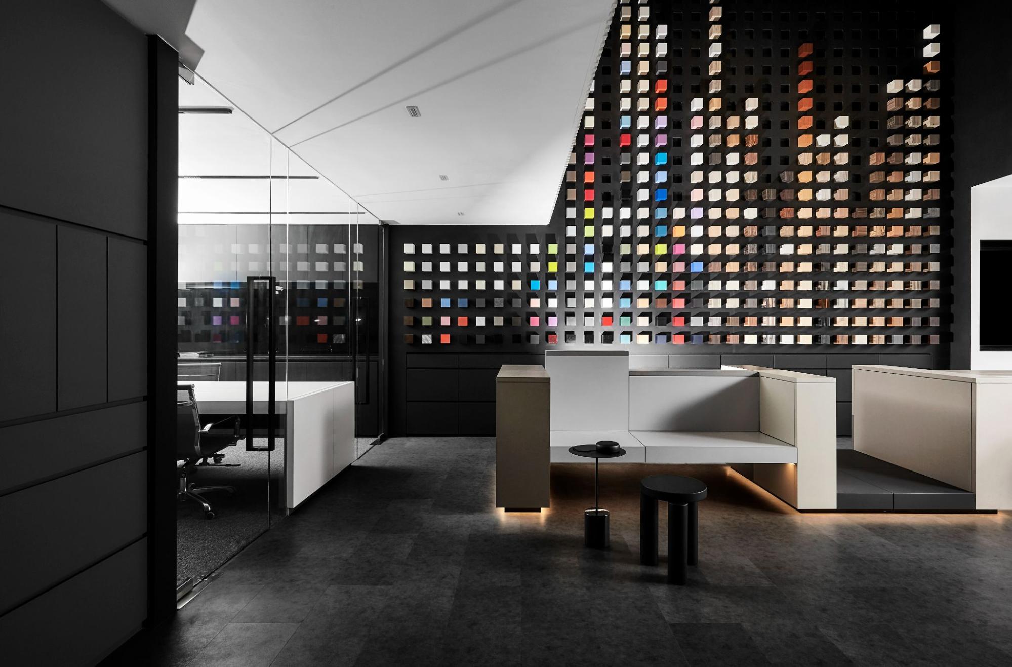 Image credit: Arova
On top of that, Arova’s rolling out a massive 10th-year-anniversary collection, featuring over 70 new laminate designs and textures – like wood, patterns and solid colours. Besides looking trendy, they also have an anti-microbial property to kill bacteria and help you stay germ-free.
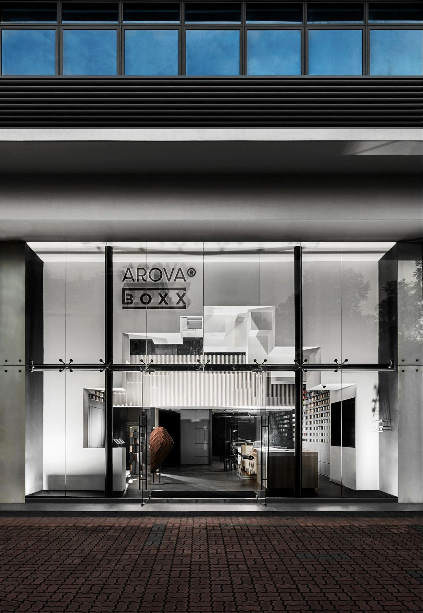 Image credit: Arova
Once you find what you like, simply request for home delivery and the folks at Arova will get your samples to you on the next day – all for free.
Now that you’re armed with four simple design tips and a laminates heaven, time to give your BTO that much-needed makeover.
Find out about Arova’s 10th-year anniversary collection
This post was brought to you by Arova.
Cover image adapted by @lxhomedecor, The Spruce
