Google slides hacks
Whether it’s for a school presentation or you’re pitching an idea to your lao ban, one of the defining factors of an engaging presentation is how you verbally communicate your points. They should be simple, easily understandable, and straightforward. But it’s no secret that your presentation slides are equally as important in getting your audience’s attention.
Here are some Google Slides hacks to make your presentation much more engaging and interesting – so you can score extra points for that long-awaited promotion.
Table of Contents
1. Create a table of contents that links to other slides
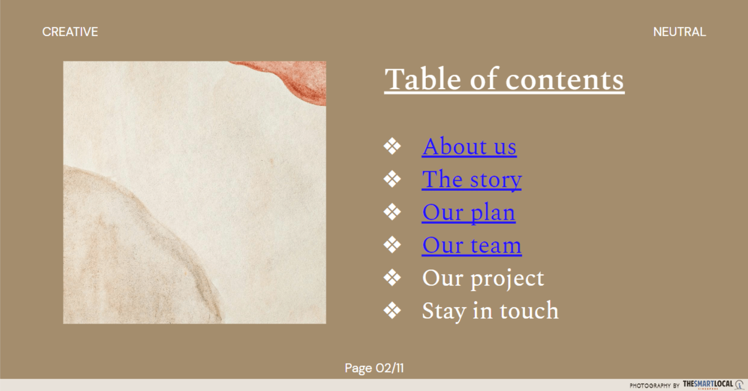
Adding a table of contents to your slides helps to give an overview of your presentation. It can also serve as a list of clickable links that jump to the slides you need right off the bat. This is probably one of the only few times when spoilers are acceptable.
This way, you and others looking through your presentation can jump to the relevant sections right away without having to scroll tirelessly. This will also come in handy when referring to a slide during Q&A sections.
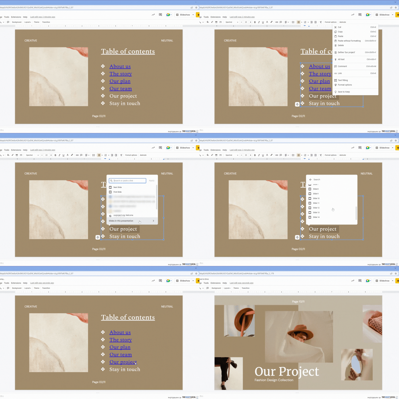
To do this, list out the points you want to link to. Then, highlight each point and click “insert link”. At the bottom of the pop-out menu is another button that will lead you to a list of all the slides in the presentation. Pick the slide you’d like to link from there.
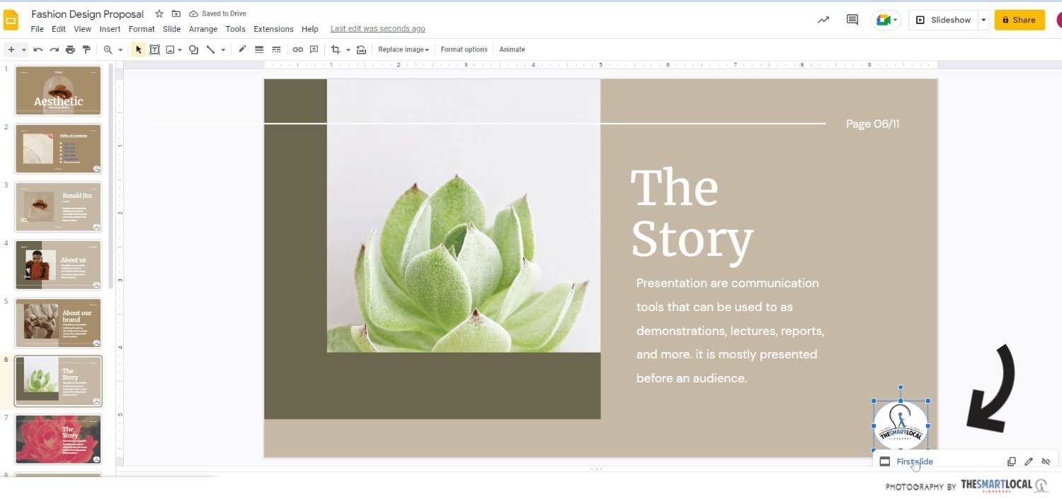
Tip: You can add an image or icon in the bottom-right corner of all your slides that link to the first slide, which leads you right back to the table of contents
2. Crop your images to different shapes easily using slide tools
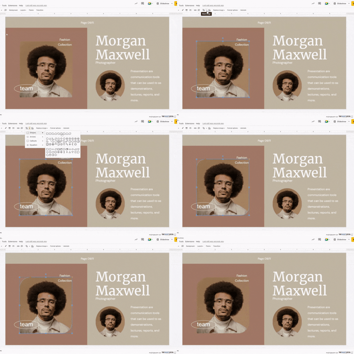
Instead of just slapping on your images, add some uniqueness to your slides by cropping them into different shapes like circles and hearts. Select the image, click on the drop-down arrow beside the crop button, and pick your desired shape.
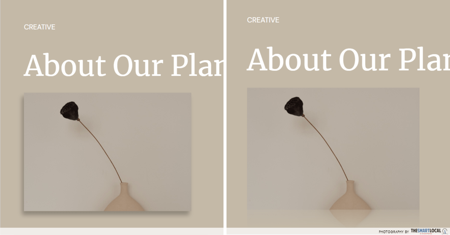
Adding drop shadows and reflection effects on your images can add an edge to your slides.
Rounded cropping will make your slides look more aesthetic. You can also add drop shadows and reflection effects to images to give more dimension. Though subtle, it does make a difference. You can find them in “format options” after clicking on your desired image.
3. Align elements perfectly with the distribute tool
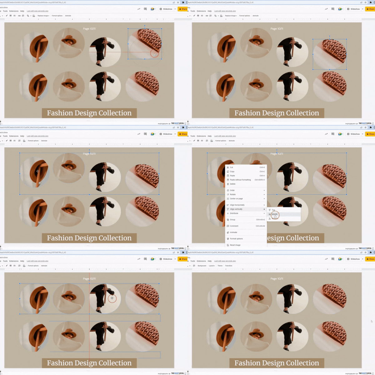
Create a menu mock-up or a section showcasing your product mix’s range.
If you’ve been dragging your text boxes and images around until they align, this tip will be a life–saver. Select the elements you want aligned, right-click, and then select the desired alignment. You can align them to the left, right, or centre.
This simplifies the process and makes your slides look much cleaner.
4. Animate words & images for a Keynote-level PowerPoint
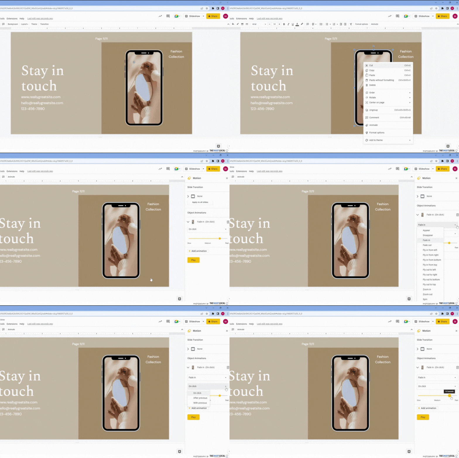
Add some personality to your slides with a cute cat popping up from the bottom of the slide or a rocket zooming in from the right. You don’t have to pick up any animation software for this hack – everything can be done on Google Slides. Make your words and images move, appear, and disappear during your presentation.
Simply select the desired element, press “ animate” and a sidebar will appear. From there, choose to have your element start moving once the slide comes on or on your click.
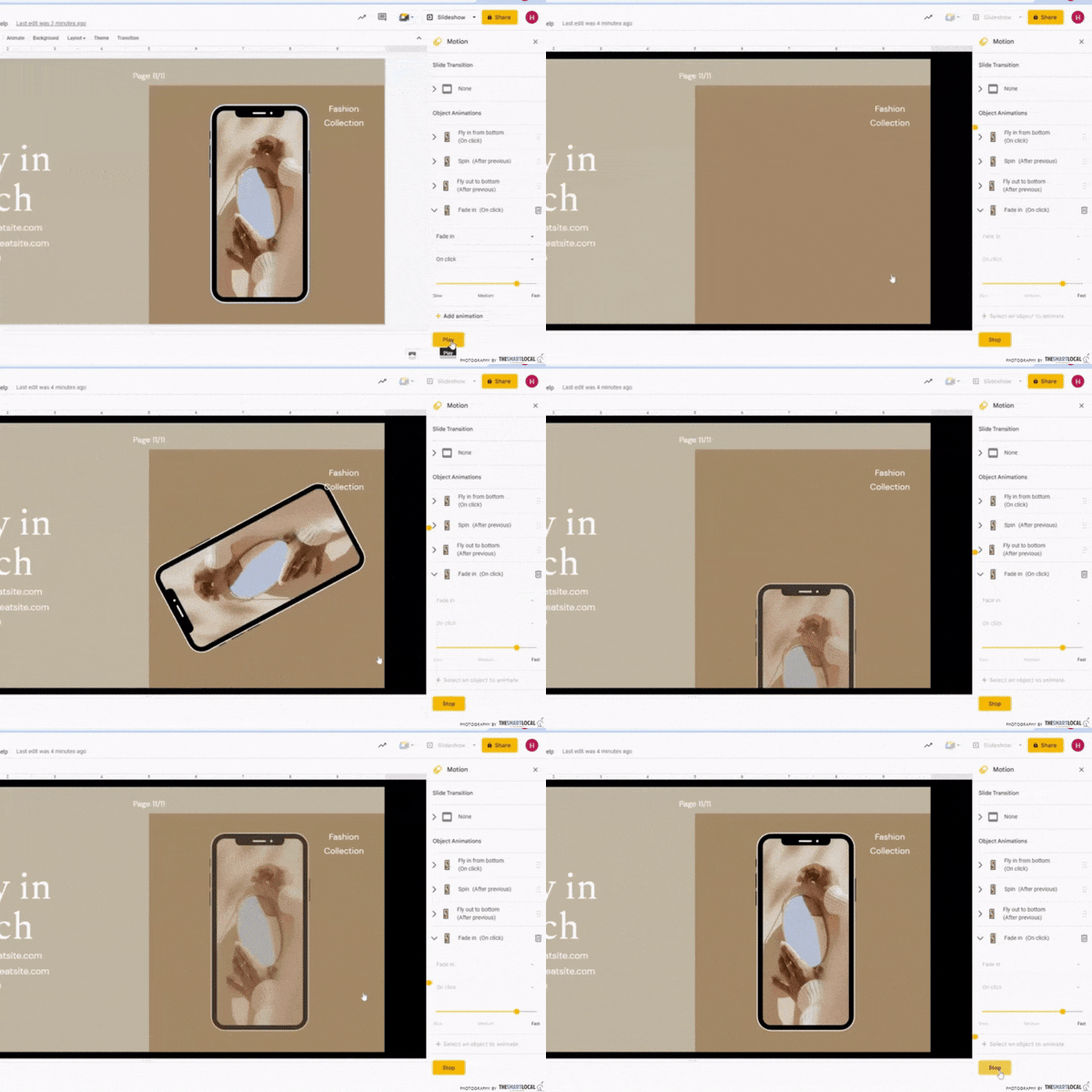 You can also stack animations to make an element move continuously.
For a seamless animation that plays one after another without pause, select “after previous” instead of “on click” under each of the animation commands. Hit “play” at the bottom to check how your animation sequence plays out.
5. Use shapes to customise your slides
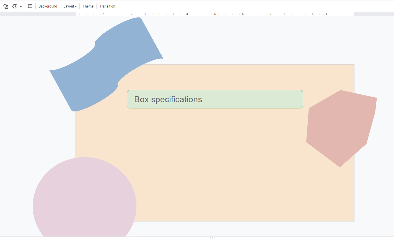
Make use of wavy, round shapes for a softer look and rectangular, sharp ones for a bolder look.
Shape how you want your slides to look by customising them with shapes of your choice. You can pick different colours to outline and fill your shapes. For a super minimalistic aesthetic, make your background a light neutral colour with muted-coloured shapes.
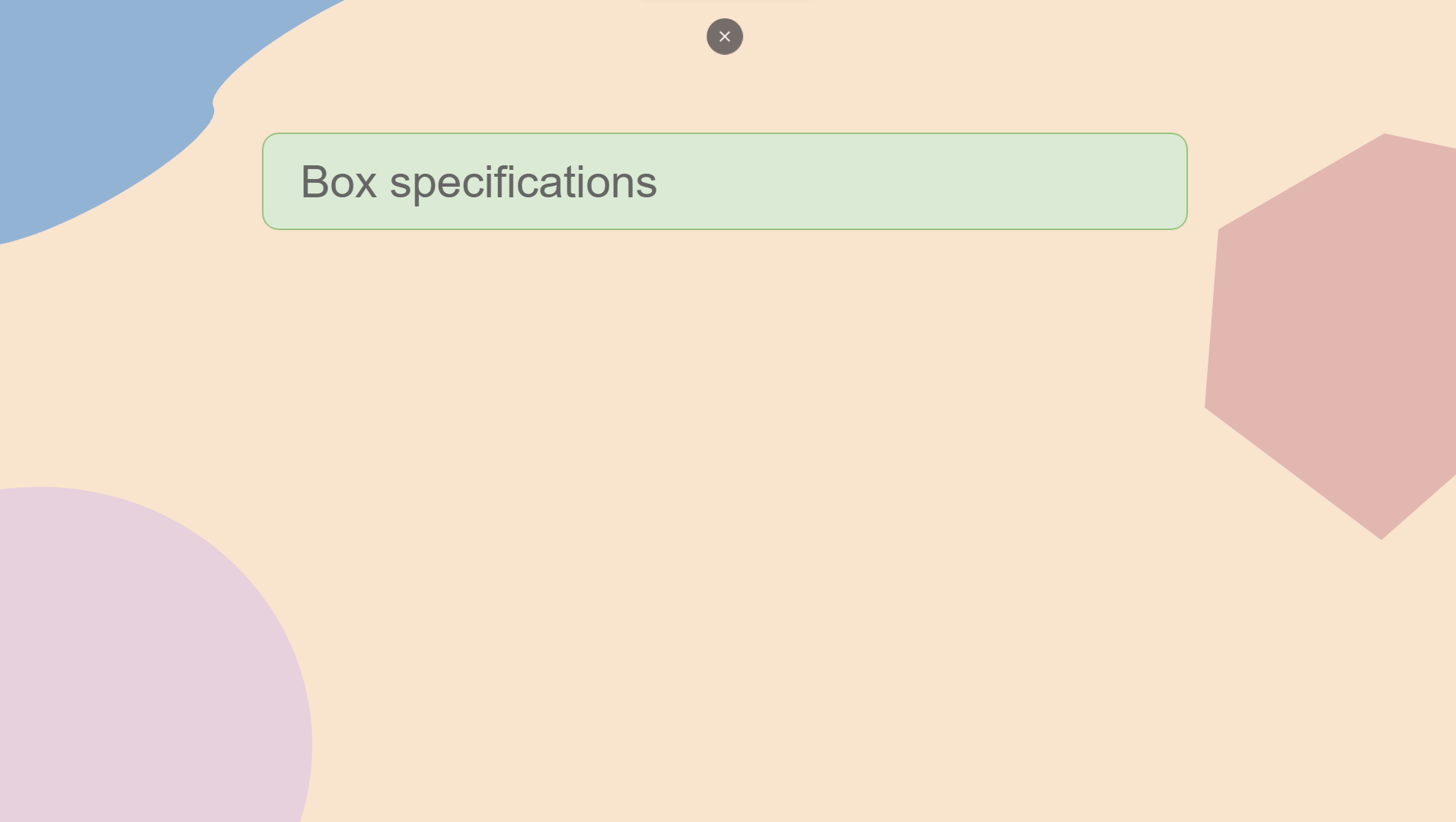
Slideshow view.
Aside from that, you can use the scribble feature to add scribbles and doodles of your own. You don’t have to make sure it’s perfect, as Google Slides will clean up your doodles for you. So let your inner Bob Ross jump out.
6. Get high-quality icons from The Noun Project for a profesh look
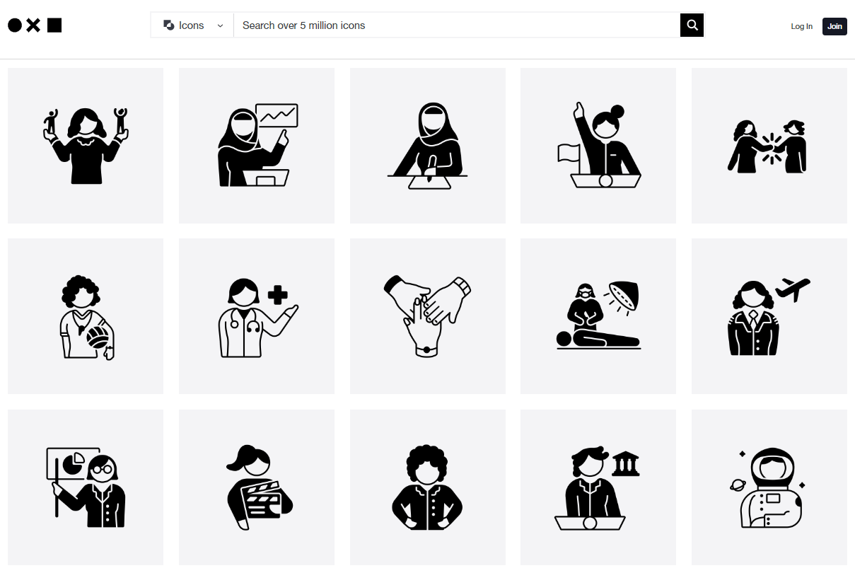
The Noun Project has inclusive sticker sets featuring women and those with disabilities – we stan representation.
Image adapted from: The Noun Project
Add visuals to support your pointers with icons. You can outsource them from sites such as Flaticon and The Noun Project. The latter has over 5 million icons in black and white for a more professional look. With its wide variety of assets, you’ll get more complex and specific icons such as a wheelchair-bound person watering plants and a man bowing on the ground to his boss.
For a more vibrant and iconic presentation, try IconScout’s 3D icons. This is especially helpful when you want to stand out in school presentations.

Image adapted from: Pixabay
And if you need some good stock images, look no further than Unsplash and Pixabay. Pixabay has free downloads without the need to credit them, for faster and stress-free image-sourcing.
7. Download aesthetic slide templates from Canva
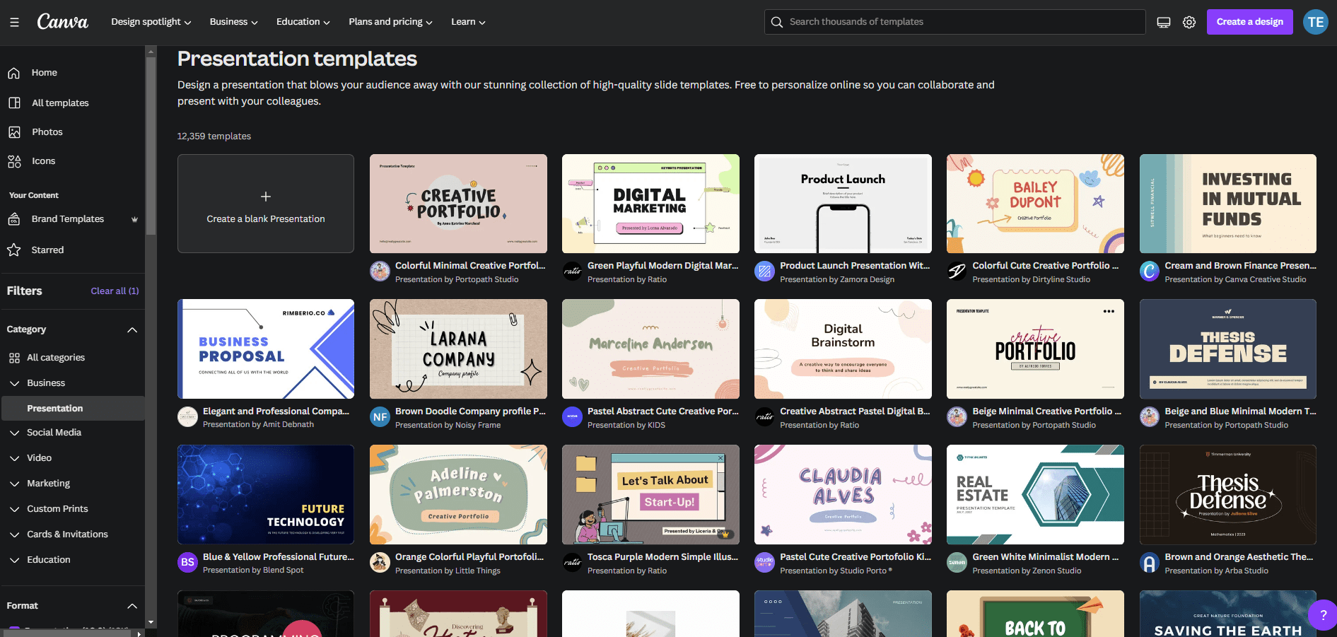
Pick from a myriad of aesthetically-pleasing slides on sites such as Canva.
Image adapted from: Canva
Trick your lecturer and classmates into thinking you’re a graphic design pro. Slide on over to Canva and you’ll find a ton of ready-made templates. From minimalist earthy tones to simple professional slide decks, you’ll find something that fits any aesthetic.
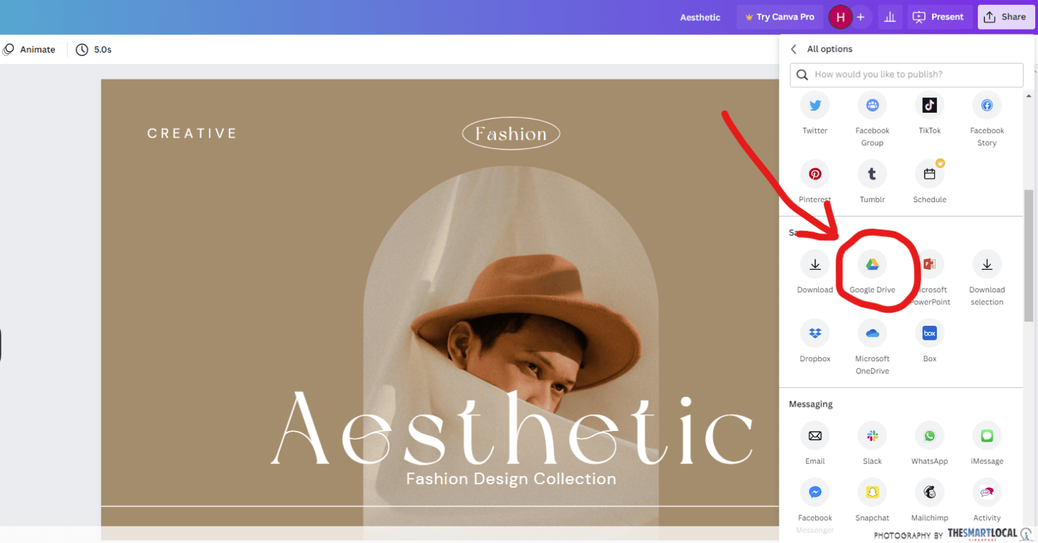
To import your chosen Canva slide template to Google Slides, select “share”, followed by “more” – then, find the Google Drive icon. You can even link your Google Drive to your Canva account for a seamless transfer. Once shared to the Drive, all you have to do is open the template in Google Slides and get to editing it to your heart’s content.
Do take note though, that some fonts don’t get transferred over to Google Slides – you can instead choose to put your slides together on Canva to keep the beautiful fonts intact. Once done, save it as .png, then paste each slide in its corresponding order on Google Slides.
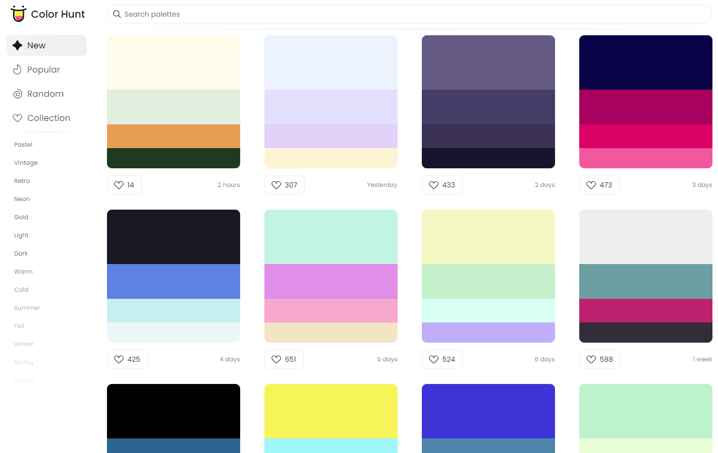
Colour your slides like a pro with colour palette generators like Colour Hunt and ColourSpace.
Image adapted from: colorhunt.co
Besides Canva, you can find more free yet beautiful slide templates on Slides Carnival, SlidesGo, and Graphic Panda. SlidesGo and Slides Carnival templates come with the fonts intact so you can import and use them with ease.
Change out the colours on the slide template if you like a design but want it in a different colour. Simply click “background” and change the colour. You can also select individual elements and change their colour to match.
8. Use gifs to get animated slide backgrounds
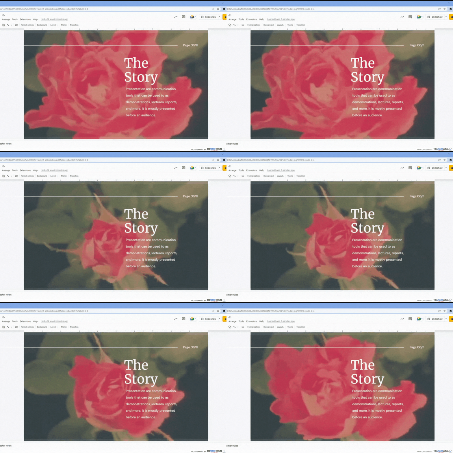
Just like how you awe at live wallpapers, wow your audience with moving backgrounds. You can do this by inserting gifs as the background of your slides – but perhaps lay off The Office and other internet memes for this one. Whether it’s a cartoon traffic scene or a natural landscape, you can slap it onto the slide, select “order”, then “send to back”.
You can get gifs from sites such as Giphy. Simply save it then drag and drop it onto your desired slide. If you don’t want the gif to steal the show, toggle and lower its transparency under “format options”.
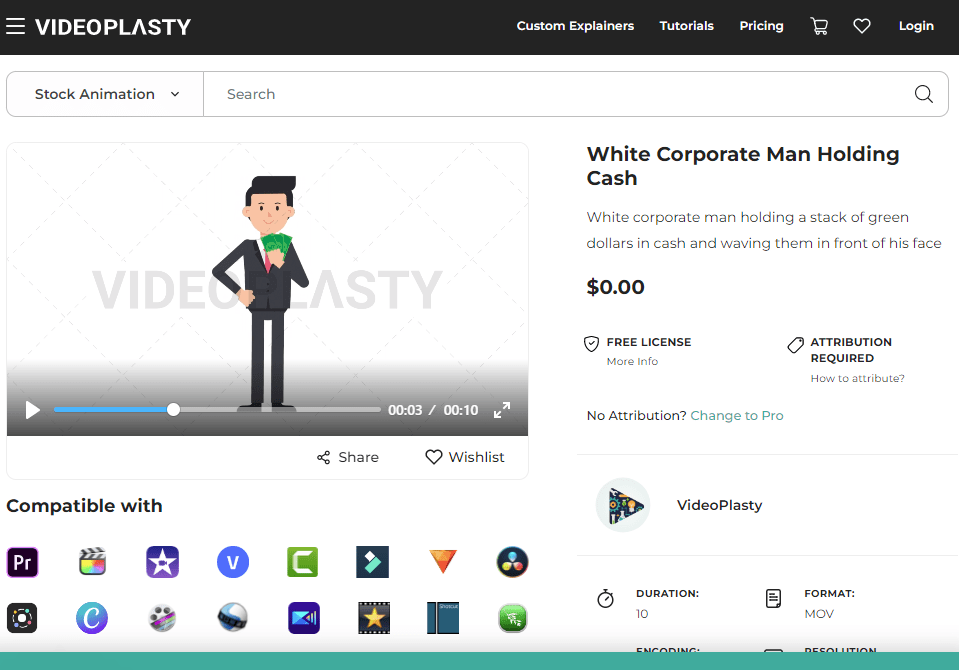
There are stock gifs of corporate people for your business slides.
Image adapted from: Videoplasty
Besides backgrounds, you can also get moving icons to add dynamics to your slides. For stock gifs and animations, try Videoplasty. You get interesting icons ranging from hand-washing to a dizzy zombie woman. They have both free and paid content with packs of specific characters.
Make a powerful point with these Google Slides hacks
Whether for school presentations or a work proposal, we’re often finding presentation tips to score points. And many of us often use Google Slides for its ease of sharing and collaborating with team members.
Besides the public speaking part of it, slides are equally as important in drawing attention. So pick up some of these Google Slides hacks and apply them to your next presentation.
More articles to boost your work or school performance:
