It’s less than a week into the brand new 2014, and most of us are probably still reeling from withdrawals after rounding up 2013 with endless celebrations, gatherings, and possibly a massive amount of binging.
While it’s still introspective season where we take a good look around us and remain hyper aware about the different aspects of our lives, it randomly struck me that I should make a marked effort to watch the television more. Aside from other more decent resolutions I should be thinking about, like the ones here and here.
Why I need to watch more TV
You must think I’m insane. Who has time for TV when you’ve got a million other more important things to do (besides Thought Catalog-ing till wee hours in the morning)? But really, I’ve been so hooked onto online media that I’ve totally sidelined TV time, which means I’ve probably missed noticing some remotely interesting ads.
While I understand that we’re also bombarded with ads online as well, the kind of ads we see on TV just aren’t the same. We all grew up with TV, so y’know what I mean?
I bet the echoey voice lulling “London Choco Roll…” is already reverberating inside your head.
So while I was thinking of this, I’d decided to pull up a list of 12 Singaporean Ads & Campaigns that have decidedly made an impression through all that clutter we are battered with every single day, whether in the form of Print, TV, Outdoor or an Online Ad – anything.
Let’s take it as an opportunity too to recognize the genius in some brilliant ads that should make us proud of the fact that they are the brainchild of marketing gurus rooted here in Singapore-land. And also a chance to take a seat back and drop those jaws at some so unimaginably impossible.
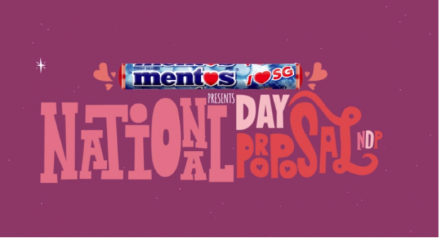
The Funky: #1 National Day Proposal
Who: Mentos Singapore
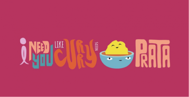
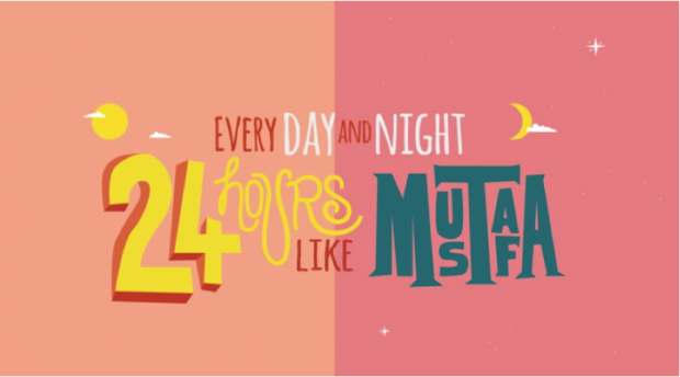
What: We know countries are typically gendered as females and the marriage of 2 females isn’t exactly normal. Still, Singapore went on the bold front and went down on her knee to ask for Finland’s hand in marriage. P stands for Proposal instead of Parade in this clever campaign, where our practical country openly declares how she’s attracted to Finland’s abundance of land, as well as its affluence and educatedness. We also learnt to pledge our love through the usage of Prata & Mustafa metaphors.
Best disclaimer ever for a Youtube Video: “Please also note that the Singapore Flyer is still operational and has not been converted into a proposal ring – yet.”
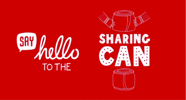
The Funky: #2 The Sharing Can
Who: Coca Cola Singapore
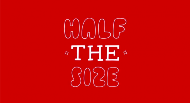
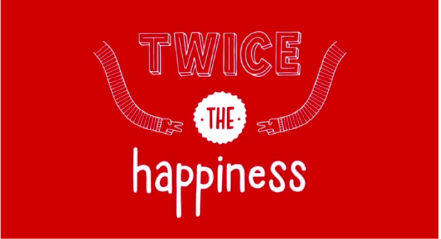
What: Twist, turn and share, because two is always better than one. After the Hug Me vending machines, Coca Cola has since come up with special cans that can be easily split into 2. These cans were dispensed at various locations in schools, the heartlands, the CBD area, awing everyone with a nimble turn of it.
While the scenes in the video remind you vaguely that they’re quite likely scripted, it’s hard to not feel the warmth of sharing buzz off the screen and make you wish you had a shot at that too.
Clever Coca Cola does it again.
The Annoying: #3 McAloo Tiki
Who: McDonald’s
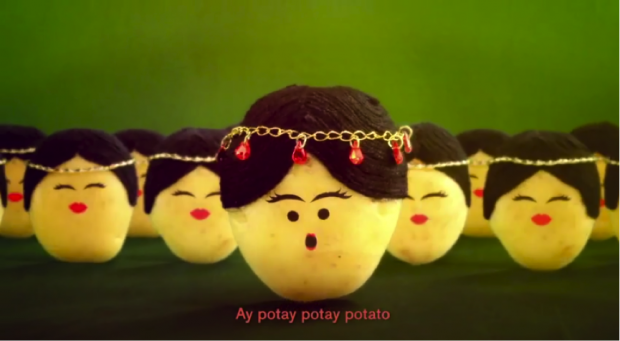
What: I knew that you knew that I knew this was definitely going in. Really, what’s more entertaining than watching pretentious little potato beings dancing around in Bollywood cheer to introduce a new potato croquette burger? McDonald’s even kindly provided sing-along lyrics, a cue for us to get started on a mini karaoke session if we haven’t already. This limited veggie-patty burger was apparently a huge hit with vegetarians here, with its Facebook announcement here garnering overwhelming response with a huge number of likes and shares within hours of its posting.
“Ay potay potay potato”, anybody? I’m starting to think it was a bad idea to include this, because this line has been resounding in my head for the past 3 hours. Help me please 🙁
The Mood-Lifting: #4 Happy Everywhere
Who: Starhub Singapore
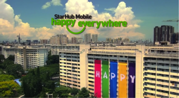
What: In December 2012, a global survey ranked Singapore as the unhappiest country in the world where its citizens were soulless, ungracious and void of emotions. For some reason, there are a bunch of us here who loves criticizing the Singaporean way too and wholeheartedly agree with the survey while continue to lambast at the misfortune that is our country.
This campaign sought to give ourselves a pat in the back and remove those negative perceptions of our very own Singapore. The cheerful strumming of music and heartwarming heartlander moments captured really set the warmth fluttering in the pits of my heart.
Sometimes, all we need really is just a reminder of how our surroundings are still bountiful of loving and caring peers that are tolerant and accepting.
I hope that’s a small smile I see sliding its way across your face already :*)
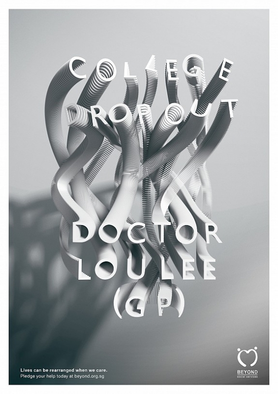
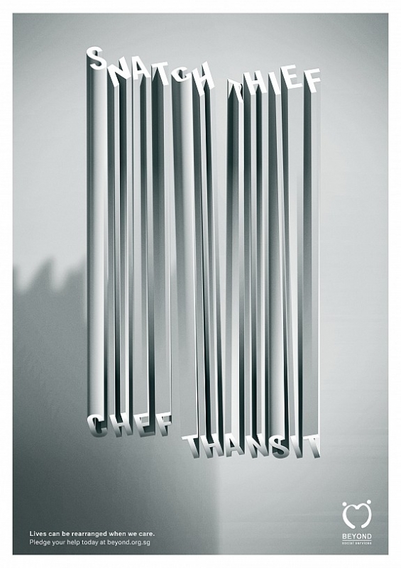
The Meaningful: #5 Rearranging Lives
Who: Beyond Social Services
What: The tagline reads “Lives can be rearranged when we care”, which illustrates directly the meaning behind this print ad – that a negative past of a stigmatized juvenile delinquent can be remolded into a positive future. The play on the typography helps represent this, and the ad served to rally volunteers for the organization’s youth rehabilitation programmes. I thought this was a thought-provoking visual reminding us of the need for social support.
The Award Winning: #6 An Affordable Necessity
Who: NTUC Income
What: By framing life-insurance as an affordable necessity and drawing parallels to our daily rice and bread, this campaign sought to encourage Singaporeans in considering the importance of insurance coverage.
While you may be thinking of your local insurance agents gleeing away happily at more commissions to earn, there is no denying that insurance is something indispensably crucial we should always make plans for.
This campaign had won a Gold at the Singapore Effie Awards 2013, and was even nominated at the AMES (Asian Marketing Effectiveness & Strategy) Awards 2013 for its meaningful purpose and effectiveness.
Remember to get your insurance policy if you haven’t, oookay?
The “W-T-F” One: #7 Eat Fresh
Who: Subway Singapore
What: I really don’t get the entire execution of this ad, and how on earth it even passed the probable tiers of approval in the company before it was released. As if it wasn’t awkward enough having a mildly creepy girl named “Rose” flick her hair multiple times at you in a sandwich ad, she speaks squeals in this Singlish accent laced with overbearing levels of bimboticness. Let us grant ourselves 30 seconds of silence for the poor lady who’s probably had her life ruined after she was made to do this stint.
Congratulations you survived the zombie apocalypse ad!
The One Screaming National Pride: #8 The Lengths We Go To
Who: SIA Singapore Airlines
What: If there’s one thing you should always remain proud of when talking about Singapore, it should be our iconic SIA girl and our worldly Singapore Airlines. Described as the epitome of Asian grace and hospitality, our SIA girl donned in the distinctive Sarong remains a powerful brand ambassador for SIA in its recent shift towards the airline’s commitment towards an exclusive service experience.
In the ad, the SIA girl traipses across various lands and cultures in her soft, elegant but strong demeanor. Blown away, I am.
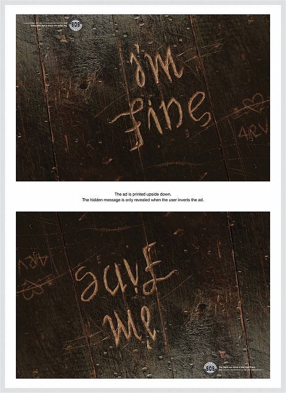
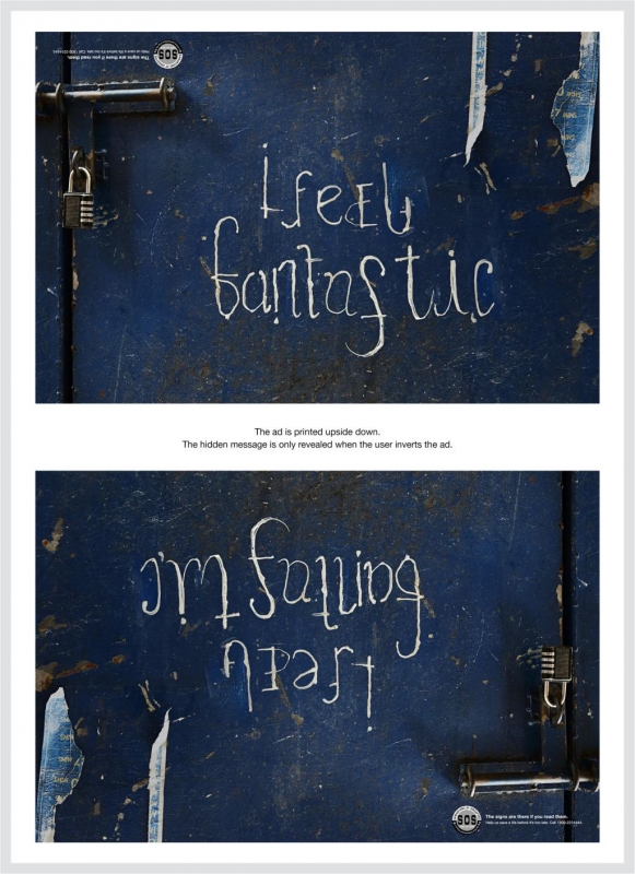
The Genius: #9 The Hidden Pain
Who: Samaritans of Singapore (SOS)
What: The magazine ads were printed upside down, with the hidden message only revealed when the reader inverts it. This was a metaphorical expression of how the pain of those who were lost and depressed is not always obvious on the surface, but that the signs are existent if only we looked deeper. These ambigrams remind us how those who needed help could merely be keeping up facades, and how it is paramount for us to reach out to them and offer proper helplines. This, I guess, is even more so for kids.
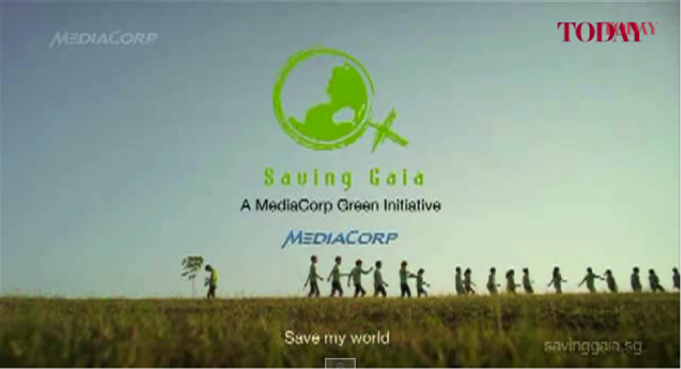
The Underrated: #10 Saving Gaia – Save My World
Who: Mediacorp Singapore
What: Saving Gaia is an initiative pioneered by Mediacorp aimed at increasing environmental awareness and spreading the green message.
While we remember from years ago a pathetic Valentine’s day stunt at Somerset MRT that turned out to be a guerilla campaign for Saving Gaia, the 2013’s campaign is tons better (albeit less entertaining) than watching a dramatic breakup transpire between a couple, where the girlfriend also screams her head off at the guy for using a plastic bottle.
Featuring the cast from Ah Boys to Men and students from 2 different schools, this lovely and cheery song pipes a pleasant tune while it’s nice watching the good Army Boy folks. The YouTube view count doesn’t do the effort put into the video justice at all, I honestly feel.
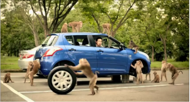
The Awkward: #11 Caltex: Monkeys
Who: Caltex
What: To show how the patented Caltex Diesel with Techron D keeps vehicle engines clean and in tip-top condition, the ad shows how using it ensures that the couple is able to escape in their car in times of crisis – eg. from a bunch of monkeys offended by one of your friends. It is admittedly quite amusing, albeit slightly too in-your-face. It’s abit awkward because leaving behind your poor friend behind doesn’t observe the brotherhood code, pal. The Monkey Sanctuary is so super cute though!
Lesson learnt: Don’t disturb monkeys when your friend has to first consider the safety of his pissed off girlfriend.
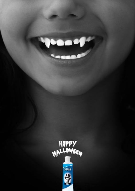
The Creepy: #12 Happy Halloween
Who: Darlie Singapore
What: Toothpaste in a ghoul mood. I just had to throw this one in for fun because it’s nice knowing that vampires and zombies probably like having white, sparkling pearlie whites too.
The END!
So there, here are 12 ads I remembered from 2013. There’re possibly tons more that my sad excuse for a brain is unable to conjure up at the moment, or that I felt weren’t interesting enough to be mentioned.
While we’re continuously bombarded with more than a million marketing messages everyday, it’s always refreshing to find that one or two that could either be life-changing, incredibly ridiculous to the point of making your day, or so annoyingly catchy that your mum hates the x number of times you’ve crooned it while washing the dishes.
Which are the ones that have made it to your own list of favourites?

